Starbucks Drink Label Research & Redesign
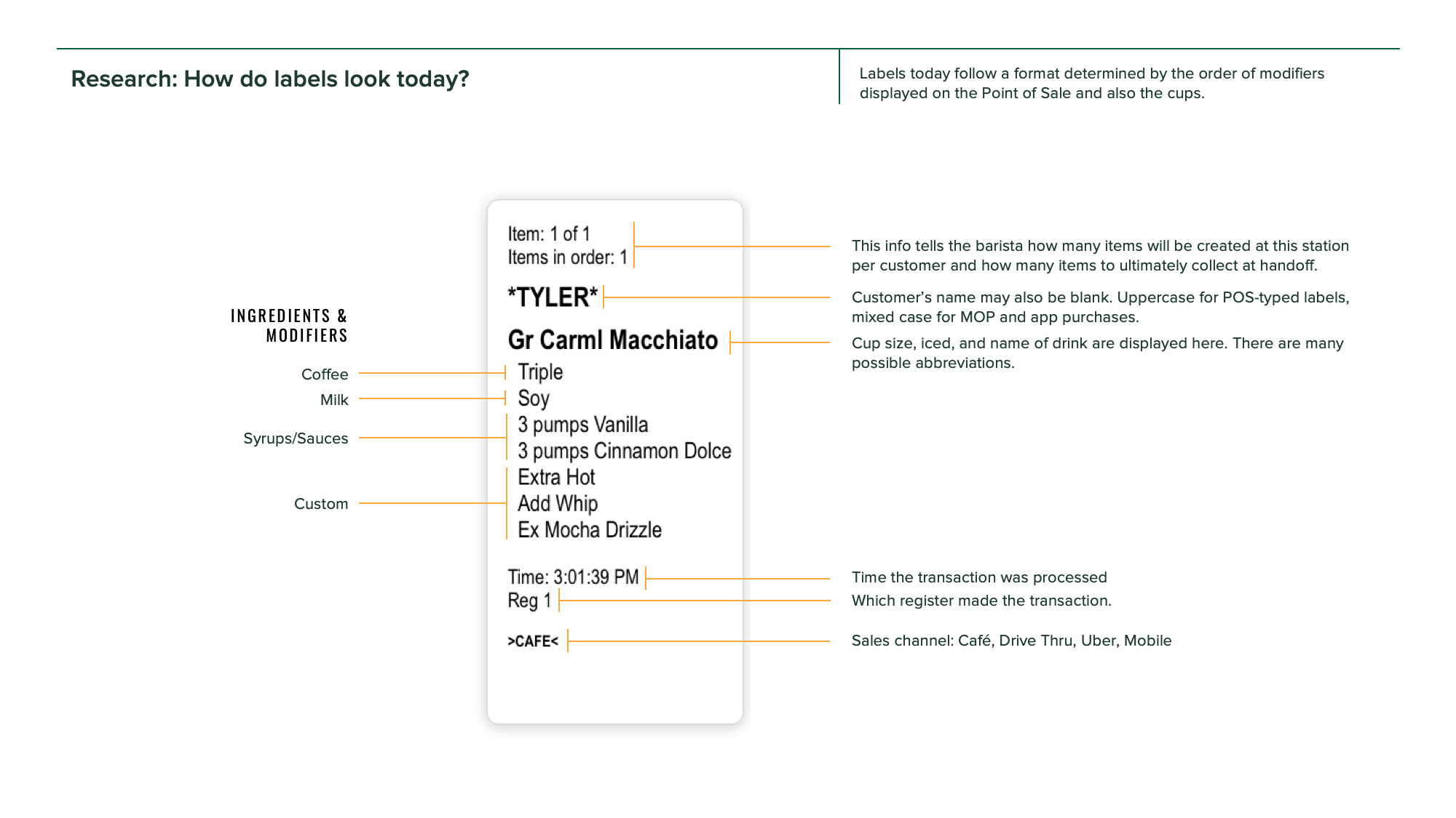
Even though most customers only see this tiny sticker on the side of their cup for a split second, the Starbucks drink label plays a surprisingly large role in customer satisfaction. So why does it look about as appealing as a parking ticket?
Background
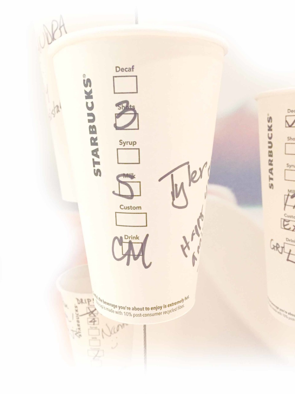
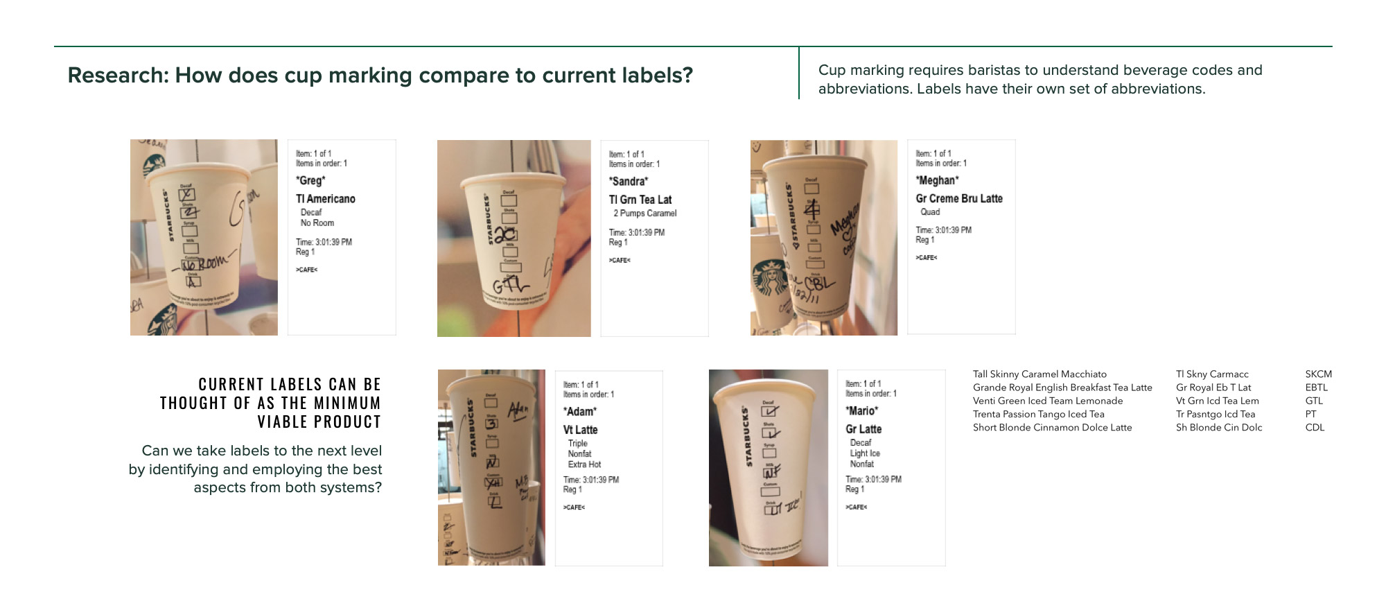
Starbucks had a long tradition of baristas ringing up customers and handwriting their drink orders on cups to be put into the order queue behind the bar. Indeed, many people at the company considered it to be one of the core elements of a successful customer connection. In 2016, Starbucks started moving its stores away from cup marking, toward a printed label system which allowed stores to more reliably track inventory and standardize pricing. The labels are now ubiquitous—millions of people interact with them every day. Clearly it was designed within tight technical constraints, to be used mainly by baristas. But for something so customer-facing, the design of the labels did not feel very harmonious with the Starbucks brand. As the company was upgrading its label printers, could we create a new label design to improve the information hierarchy and also feel more like Starbucks?
Client
Starbucks
Task
Build momentum for redesigning food & drink labels to improve usability and more closely align with the Starbucks brand.
Role
I was the lead researcher and designer on this project, collaborating with a product manager, operations manager, and two engineers.
Duration
6 months
Outcomes
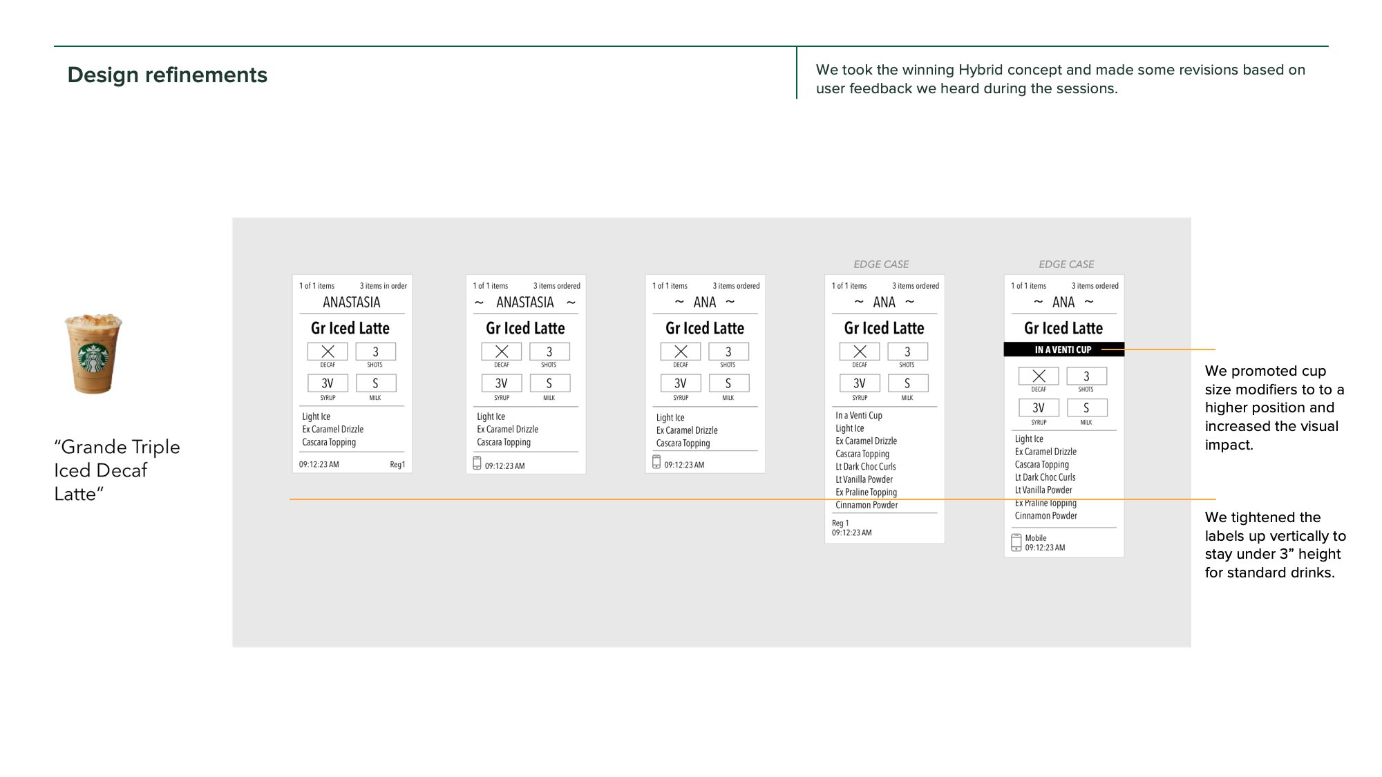
As a result of our team’s research and design efforts, the company now has a compelling case for how to evolve its label design to improve production, consolidation, and customer handoff.
In early 2019, Starbucks labels felt about as appealing as a parking ticket
The research process
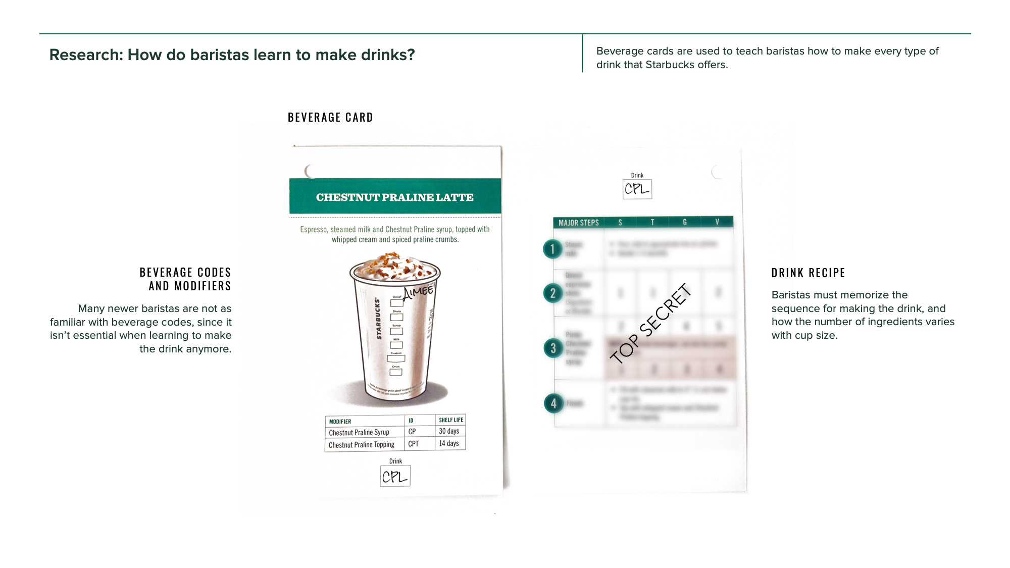
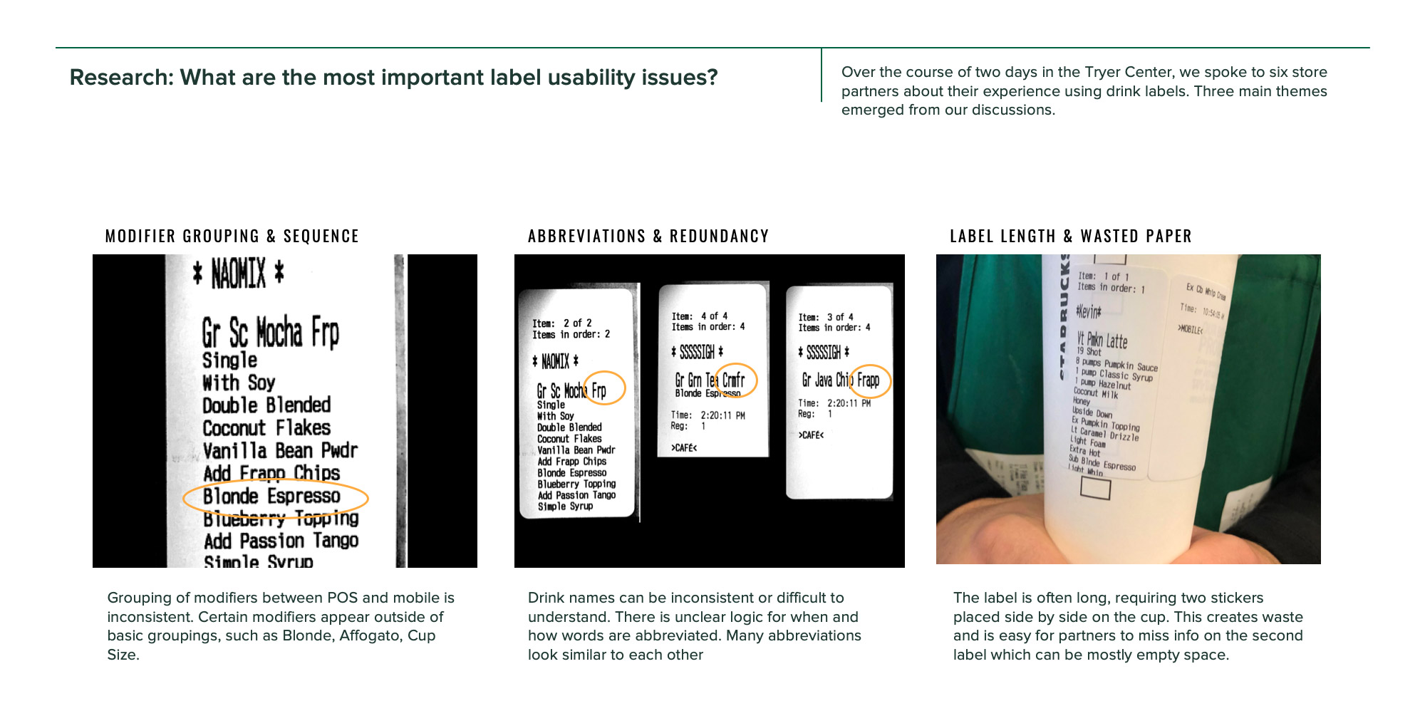
I began an independent research journey to better understand the Starbucks drink label. This was a crucial step before embarking on the redesign project because it would help to ground the redesign process in user-centered principles. I spoke to six baristas and shift supervisors in our R & D lab and learned first-hand how the label design affects the work they do.
From this first research study I was able to distill the qualities that would make an effective drink label moving forward.
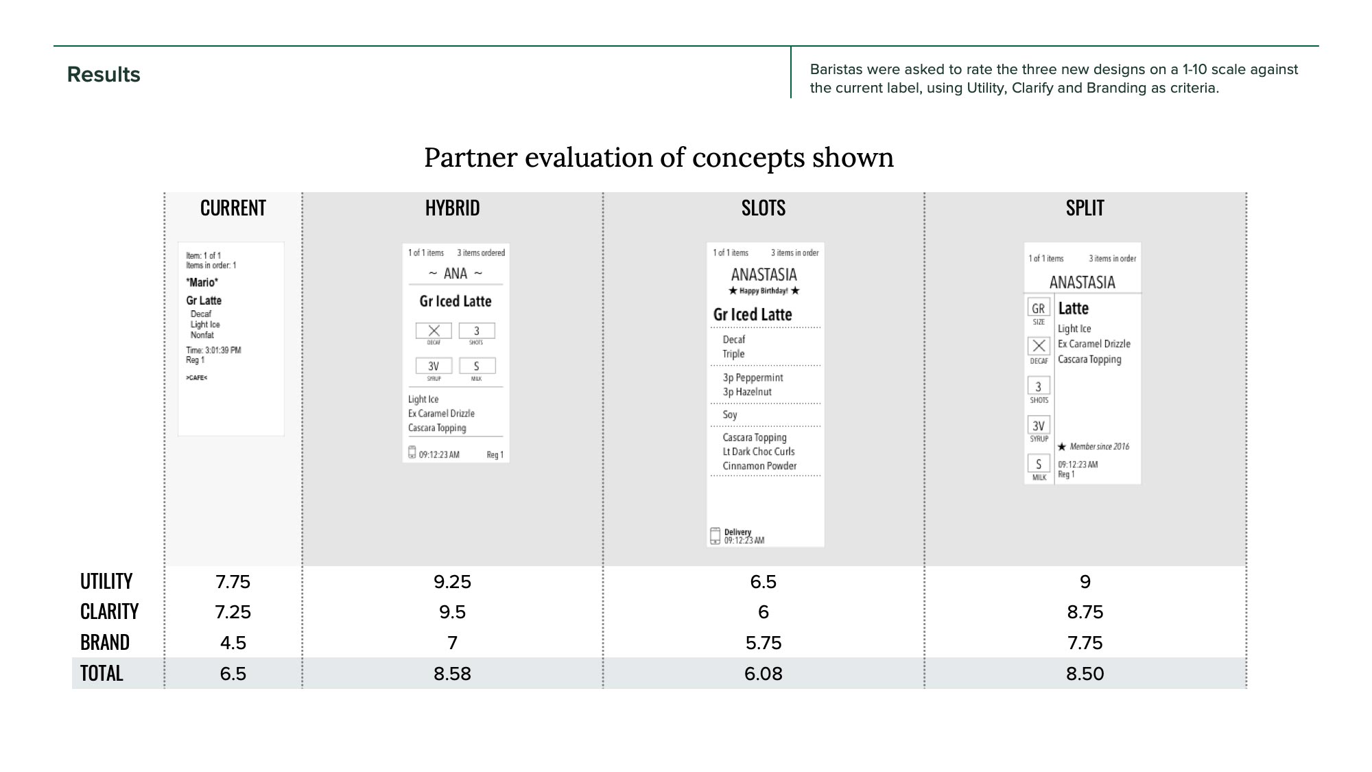
Design Criteria for Success
Utility
- Does this label tell baristas all they need to make and hand off a drink?
- Can the label flex to accommodate simple and complex drinks?
- Can the customer easily identify their drink at the handoff plane?
Clarity
- Is the label easy to read?
- Can new baristas understand how to make the drink?
- Does the label show only the information needed by baristas and customers?
Branding
Does the label create a positive connection with the customer and feel like Starbucks?
Design approach
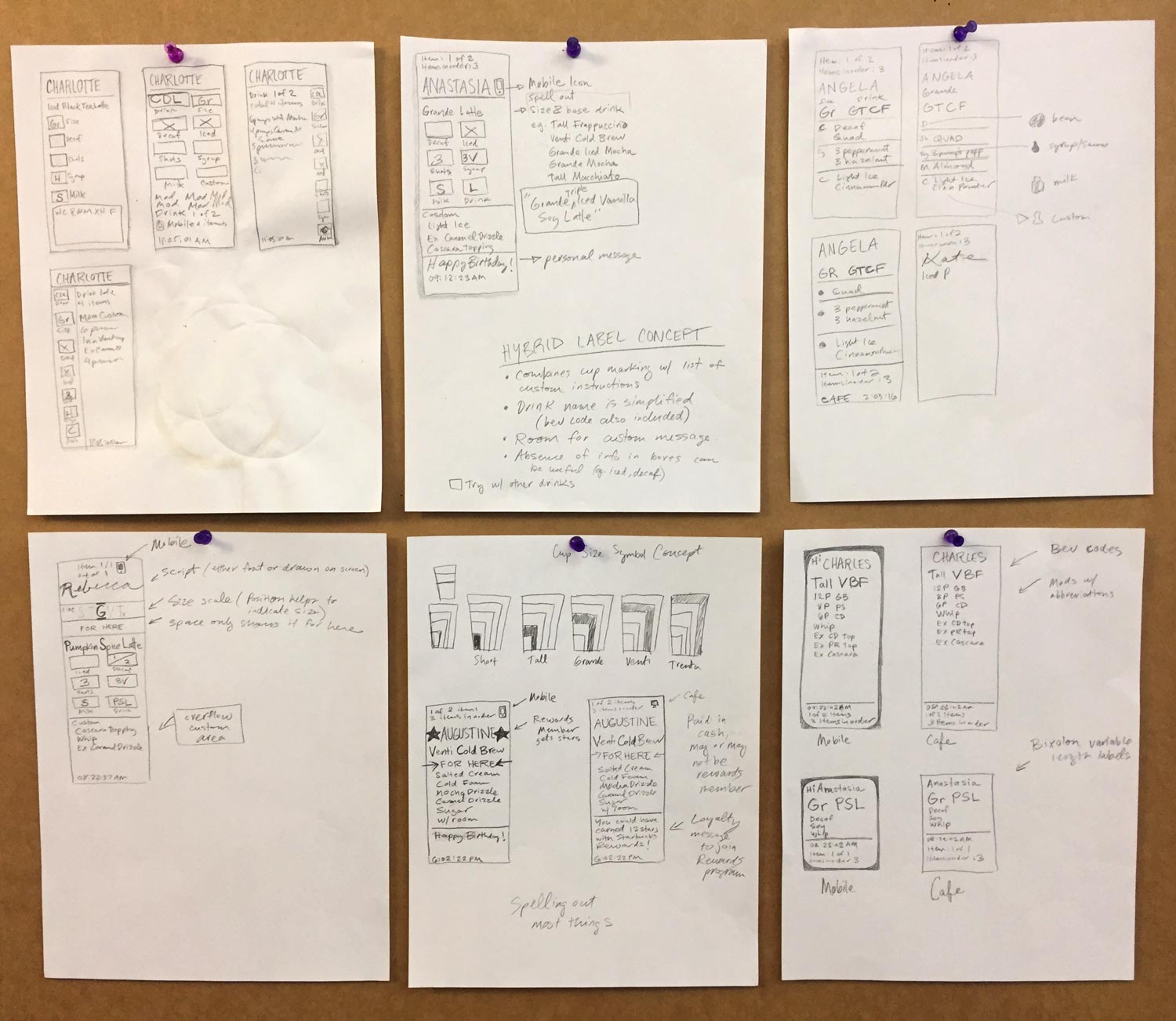
At this point I was ready to embark on the design iteration phase. I focused my initial efforts on three very common drinks: Latte, Frappuccino, and Brewed Coffee.
I maintained these principles:
- Sketch initially by hand.
- Accommodate the simplest drinks to the most complex, with every variation in between.
- Explore the use of cup marking boxes.
- Show empty states.
- Explore use of icons.
- Treat the customer’s name prominently.
- Treat the drink name prominently.
- Explore feasibility of custom loyalty messaging.
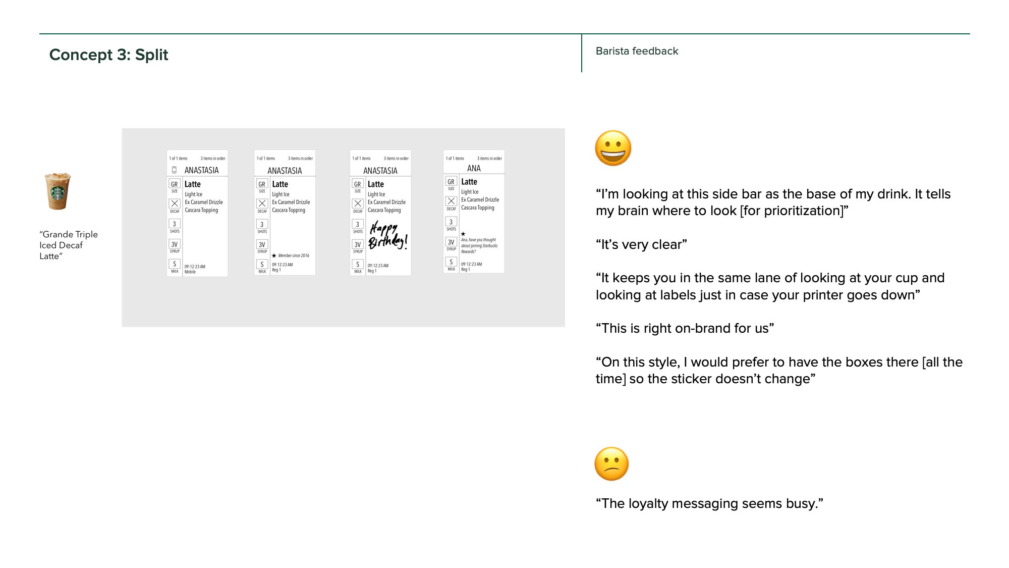
I tested these pencil sketches guerilla-style among the UX design team. This helped weed out the weaker concepts and focus on fine-tuning the information hierarchy.
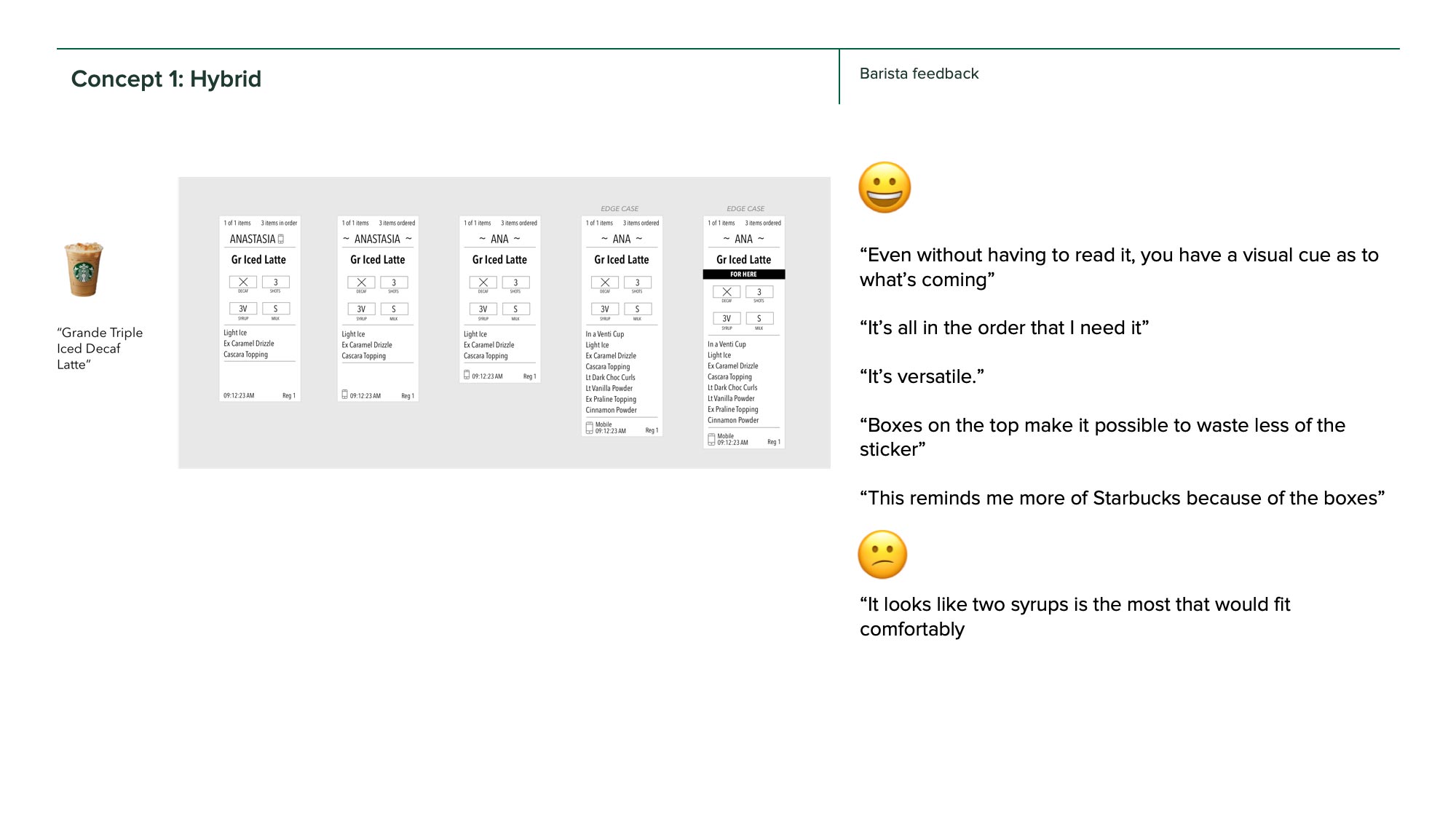
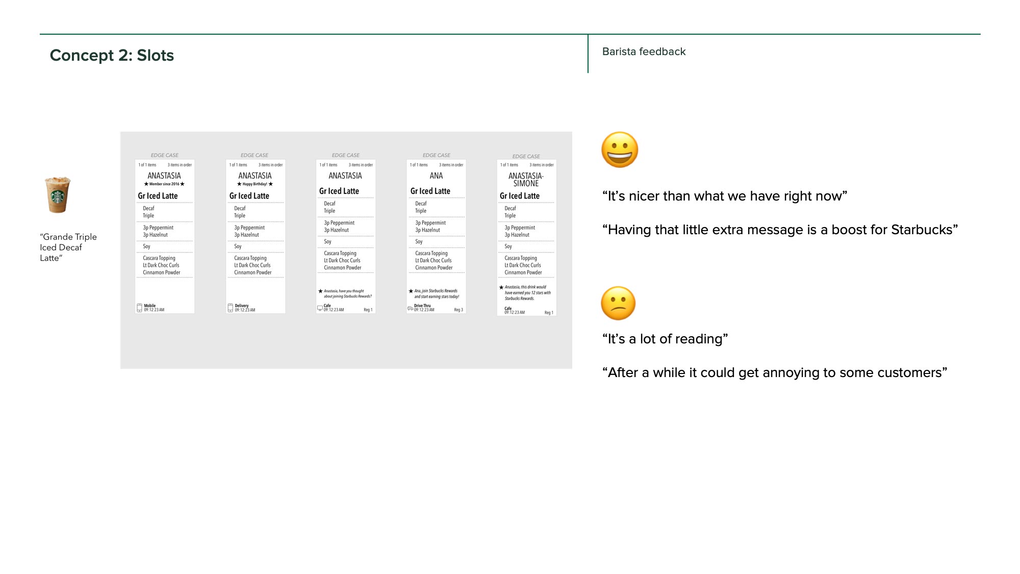
Concept testing of label prototypes
Conclusion
This project has a long story arc, one that I would not be able to see to completion before my departure. As a result of our team’s research and design efforts, the company now has a compelling case for how to evolve its label design to improve production, consolidation, and customer handoff.
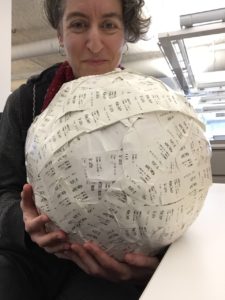
Our team’s mascot, a 30lb ball of discarded labels

