Getty Images Rio 2016 Olympics Website
Working with a team of two other designers, one researcher, six developers, two product managers, and five content curators, I helped design a successful Olympics website just two months before the opening ceremonies began.
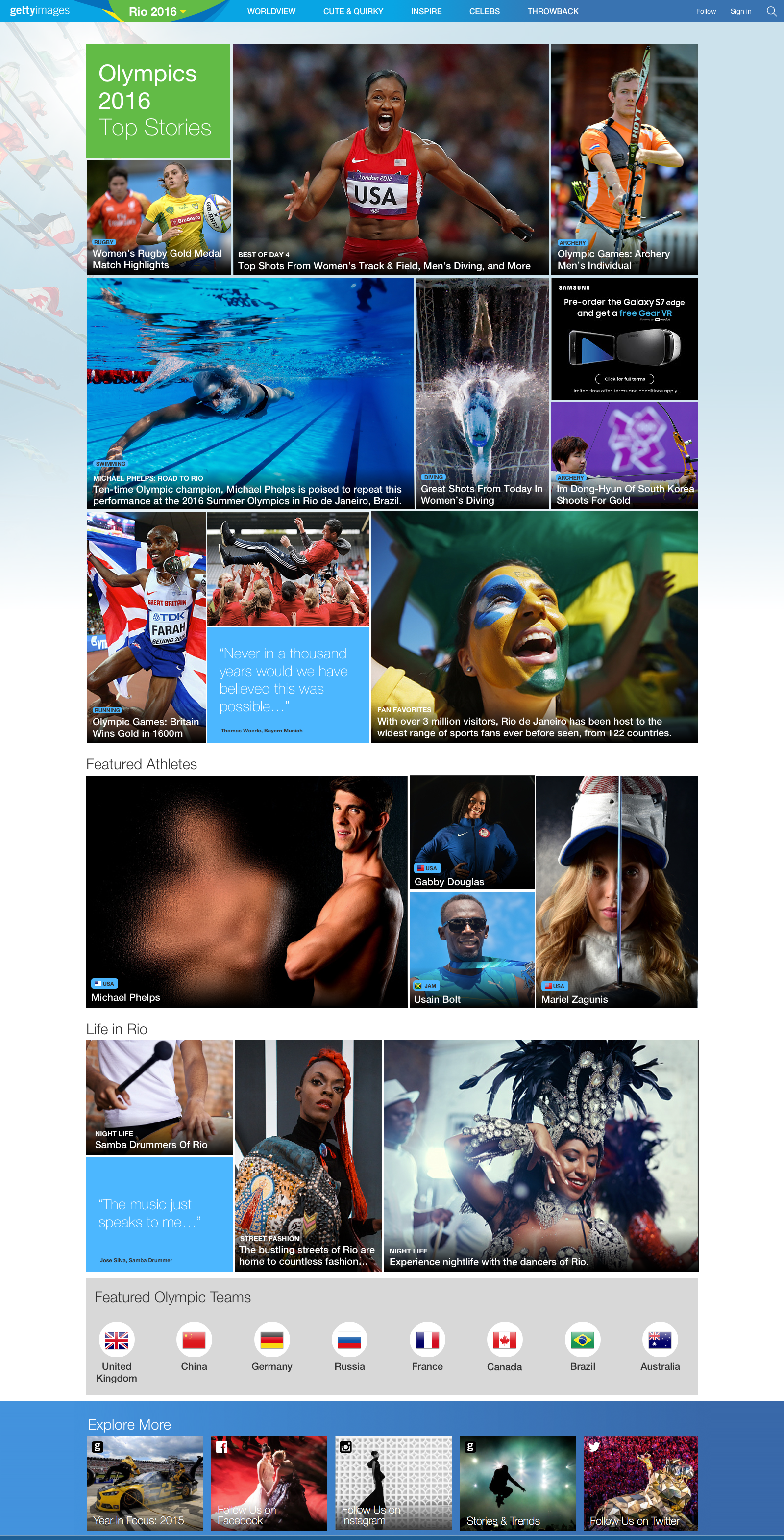
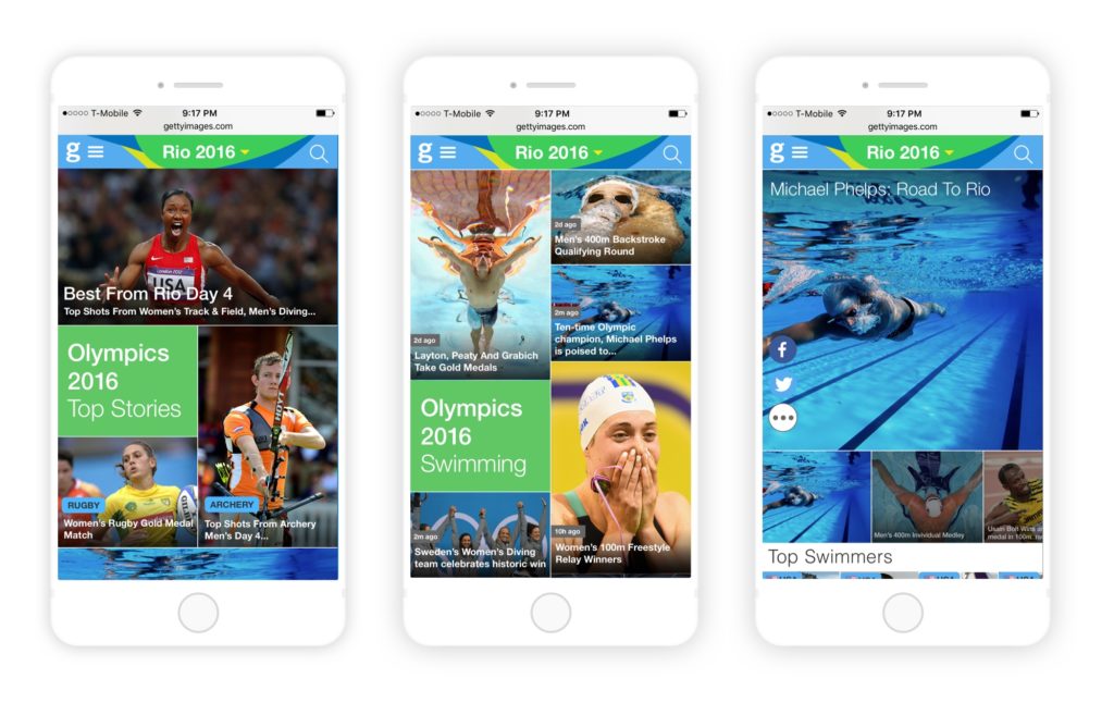
The Olympics website opening page was curated by a team of editors to reflect the most interesting daily happenings in Rio. We designed the grid to accommodate three breakpoints with slots for sponsorship deals. The blocks on this page linked to gallery pages with high quality slideshows.
Client
Getty Images
Task
As the top photographic provider of the 2016 Olympics, Getty Images wanted to showcase its exclusive Rio access with the world in ways it hadn’t done before. We strove to make website visitors feel they were right there in Rio, surrounded by the energy and excitement of this spectacular event.
Role
I led the design team of two other UX designers and one researcher. The larger team comprised two project managers, six developers, and a larger curation team.
Duration
2 months
Outcomes
- All interaction metrics on the Getty Images Olympics website were over 20% higher when compared to non-Olympic-specific content
- 5% of Getty Images traffic saw one of the pages included in the Olympics website during the Olympics time frame
- Retention rates were higher for visitors who saw the Olympics website compared to those who did not see the Olympics website
- Over 50.9 million impressions from Getty Images social media posts
- Over 230,000 impressions with Getty Images in-house Olympics merchandising
Usability research, content analysis
In our usability testing we recruited people identifying as “sport generalists” because we knew that we were not going to try to fill the niche dominated by NBC and ESPN. We asked ten subjects to talk about what they expected to find on an Olympics website and why. We learned that there existed a significant number of people who prefer more broad stroke summaries to granular play-by-play coverage. As a result of this study, we were able validate our approach and stay focused throughout the project.
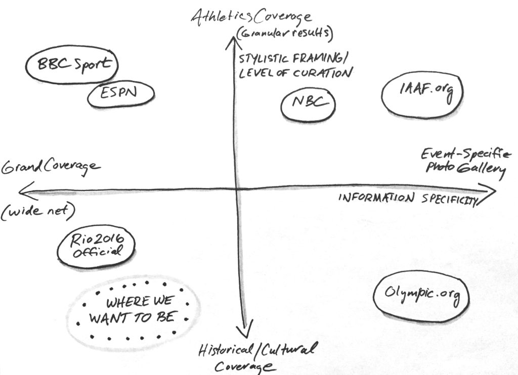
Led by our UX researcher, we positioned the Getty Images Olympic Website in the bottom left quadrant of this chart: We sought to cast a wide net across happenings in Rio, and act as a complement to sites offering granular results and coverage.
Wireframes and user flows
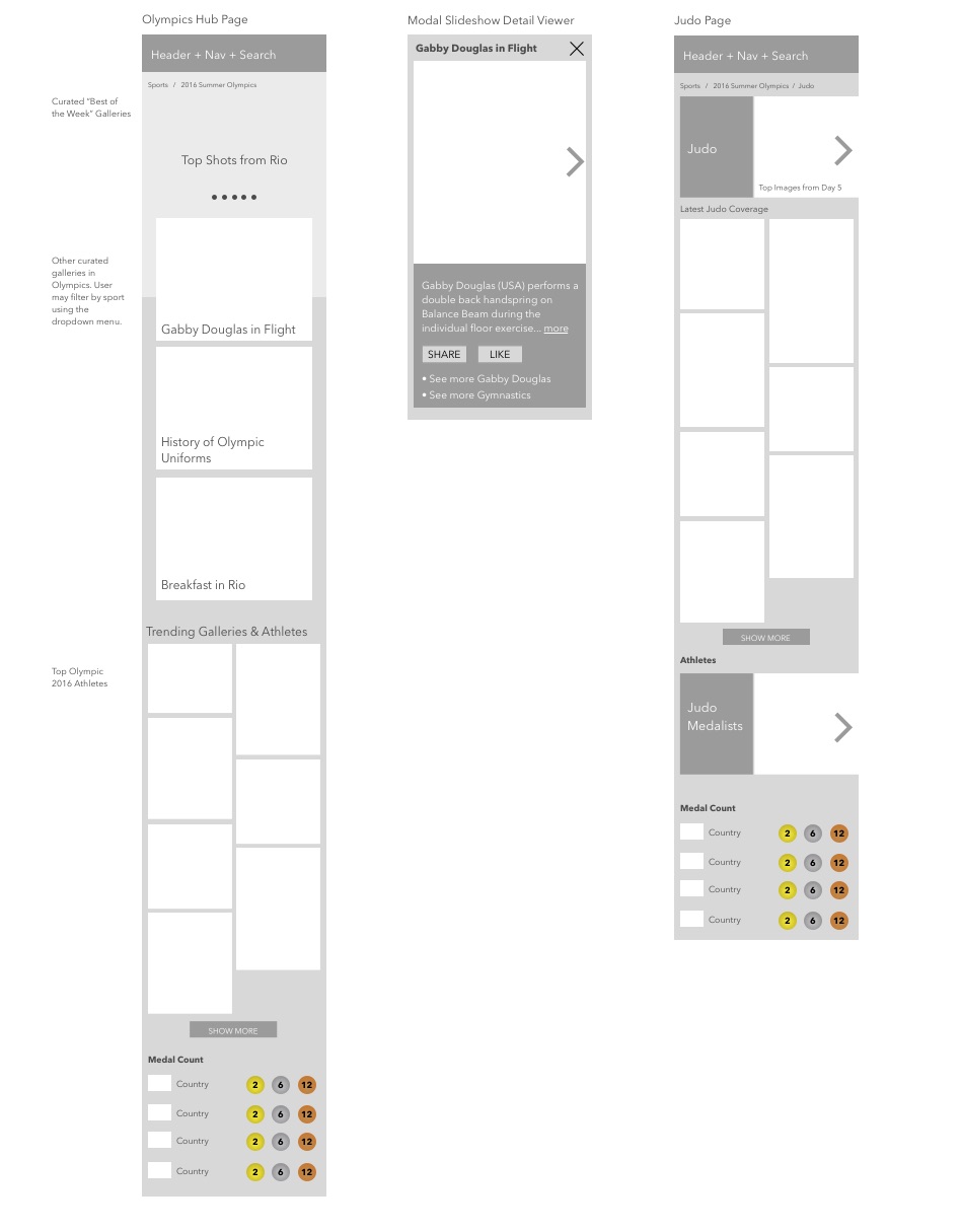
We took a mobile-first approach with wireframes, focusing on the Hub, the Image Viewer, and the Sport Landing Page.
Visual design
Olympics Menu System: We used the findings from our usability testing to determine the most desired content areas of the site. I designed this desktop maxi-menu, accessed from a Rio 2016 graphic promo on all pages of the Getty Images consumer website. I designed the promo link to be harmonious with the Rio branding through color palette and sweeping form.
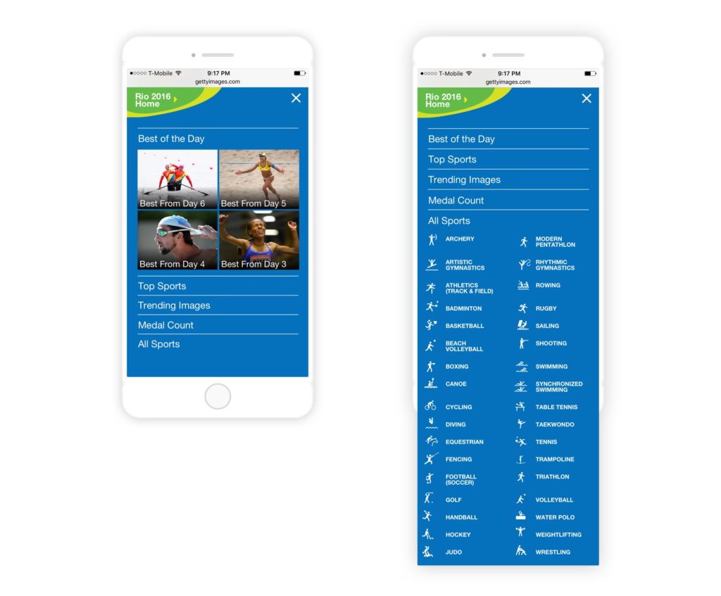
Our competitive analysis showed that consumers expected to be able to access content for every sport via a menu. This led to an icon-based menu that was a fun design challenge for me.
As another fun design challenge, I envisioned several ways to convey a medal count using a data feed updated in real time. This was the team’s preferred one because it was easiest for people to understand at a glance. Unfortunately the medal count data feed didn’t make it into the final product. That’s what sometimes happens on a tight timeline, but based on our usability study of the live site, few users missed having it.
The mobile menu system showing the day’s best content, and all sports.
An image-rich mobile experience: Hub, Swimming page, and Gallery page.
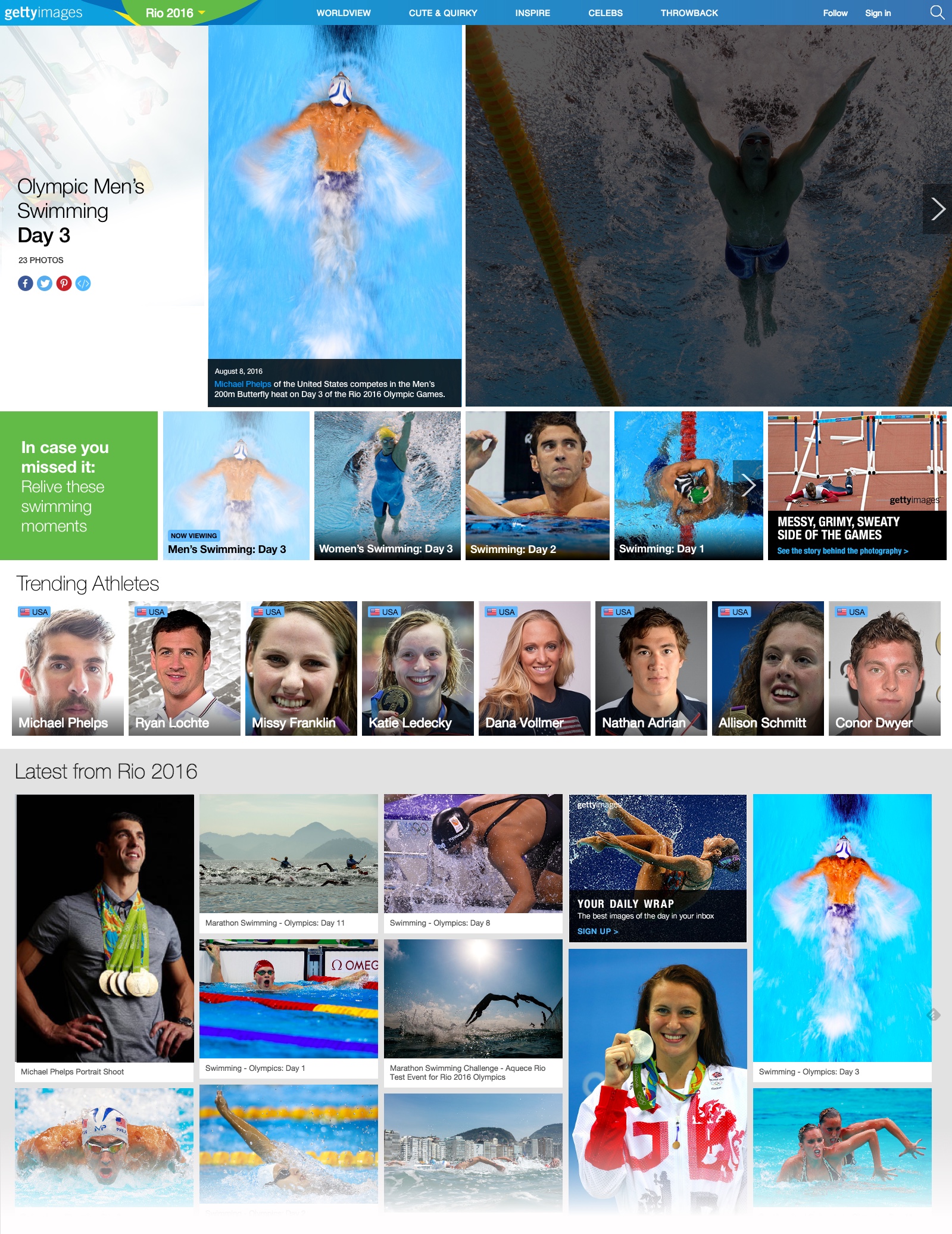
The Gallery page for desktop screens featured multiple slideshows, related people, and a feed of the latest stories.


