
Starbucks Point of Sale
In early 2018, Starbucks was planning fundamental changes to its loyalty program affecting all customers and store employees. The program would go from a simple model where customers could redeem 125 stars for anything on the menu, to a tiered model where customers could redeem at five different levels.
The added complexity would have wide reaching impacts: even hindering the transaction time by 30 seconds could increase line length and cause many customers to balk. Working with the Marketing team, Operations team, and Point of Sale team, I helped guide the research and design process to craft a point of sale (register) experience that would help to educate baristas and customers about the new program, while keeping transaction time as streamlined as possible.
Client
Starbucks
Task
We needed to make updates to the point of sale user interface used on a daily basis by over 200,000 employees at Starbucks stores in North America. But first, we needed a plan for how to approach making the updates as unobtrusive as possible.
Role
I provided UX Strategy, integrated by the Point of Sale, Marketing, and Operations teams. I also conducted field research behind the counter in four Starbucks stores, created journey maps for two personas, in-depth user flows, and UI prototypes that led to three rounds of usability testing. After handing off the designs to development, I designed and produced the company’s first interactive iPad training program to prepare store employees for the point of sale changes to come.
Duration
12 months
Outcomes
- Starbucks was positioned to understand how certain changes will affect customer transaction time and line speed.
- The company was able to transition the UI of the registers to a new user flow over the course of 3 months.
- By program launch, the training materials had over 120K views, meaning that 200K baristas were prepared to implement the changes across North America.
- 6 months after program launch, the new cash register flow has not added any significant wait time to rewards transactions.
UX strategy
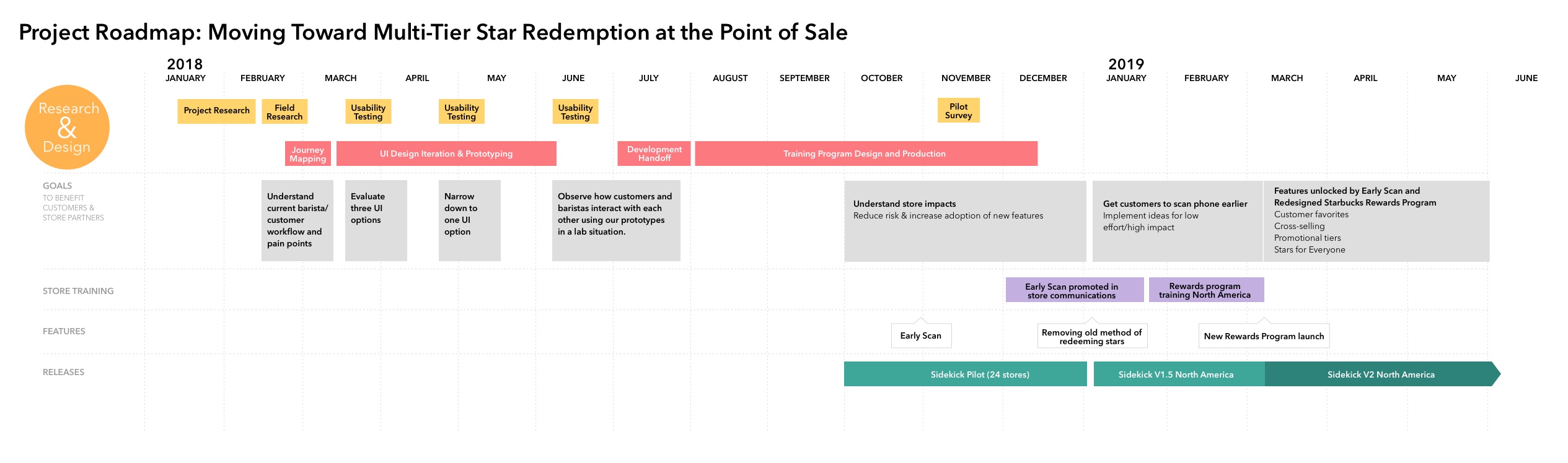
I created this strategy timeline to clarify the relationship between several moving parts and to convey that certain future features would only be worthwhile to pursue once user behavior had changed.
Research process
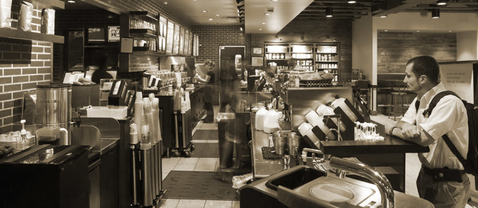
I spent eight hours doing field research at four Starbucks stores in the spring of 2018 during the stores’ morning rush hours. I stood behind the register in the café and in the drive through booth. This experience helped me build empathy for the people I’d later be designing for. I paid particular attention to how baristas moved in physical space throughout the store, how they multi-tasked, and was specifically watching for customers who used their rewards. What was the conversation like between customers and baristas when rewards transactions were involved?
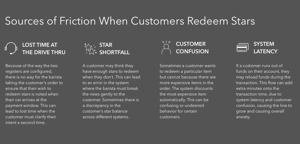
These are the four main points of friction I noticed during my store observations.

Based on my field research, I created this action map of the different roles and how they move within the small space behind the counter. Baristas are among the hardest-working people I have observed. They go through a series of choreographed motions and muscle memory allows them to be most efficient.
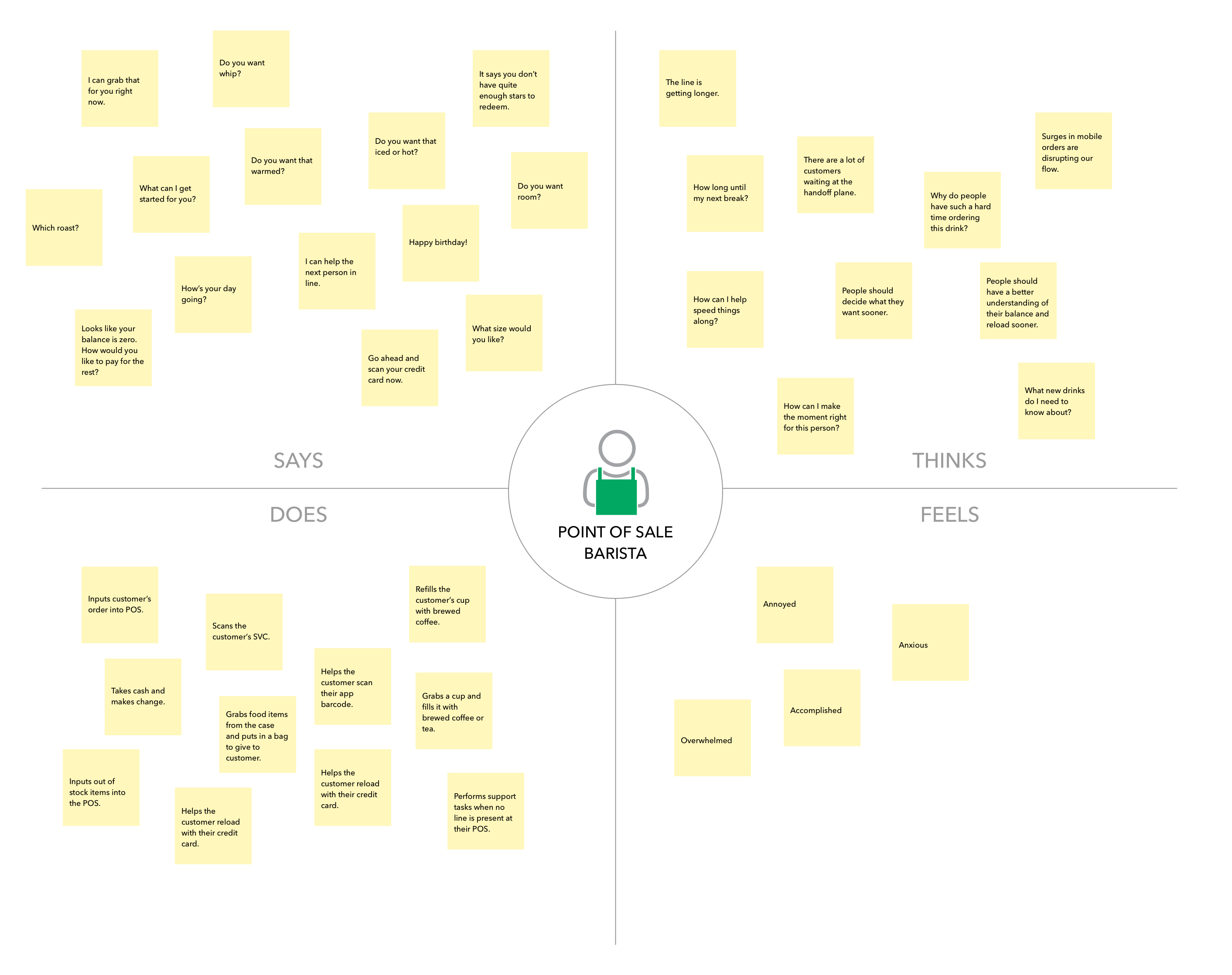
I reflected on the experience and created an empathy map which would later inform the journey mapping process.
How could we make updates to the Rewards experience that would unobtrusively fit into baristas’ current mental model and flow?
What was the barista journey like now, and which touch points would be affected by the updated Starbucks Rewards program? I identified all areas to be affected within a Journey Map.
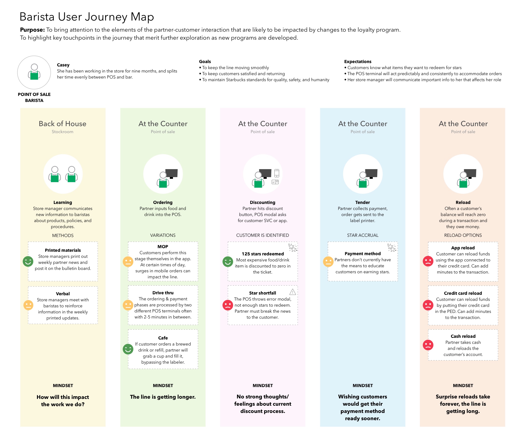
I shared this journey map with multi-disciplinary teams in order to draw attention to the areas that needed attention as aspects of the new Rewards program were further defined.
I also created a more extensive Service Blueprint to include customers arriving via different channels. This sparked a working relationship with the research team responsible for updating the Starbucks mobile app.
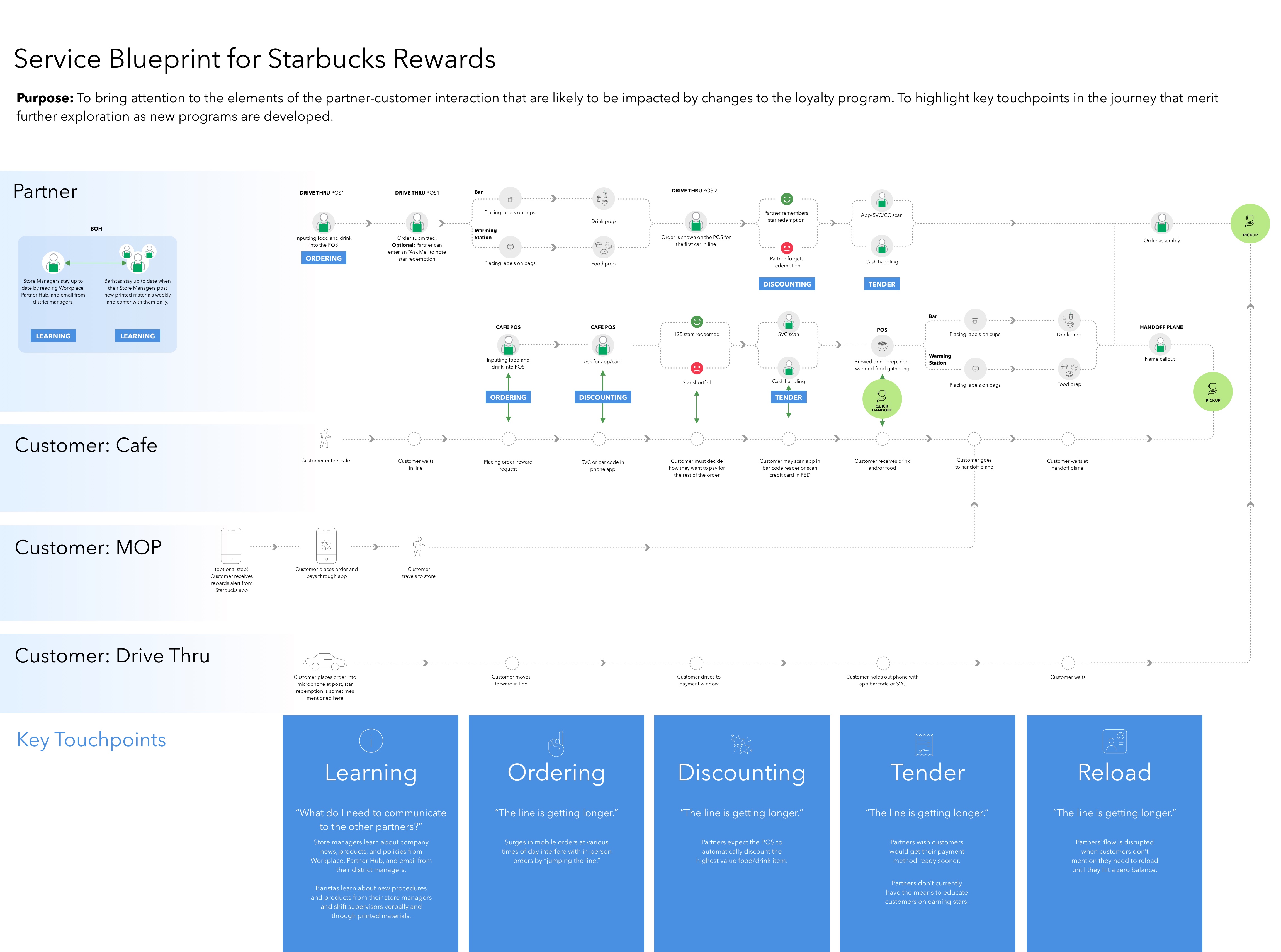
Although thousands of actions are occurring in the store during any given hour, we focused mainly on those involving Starbucks Rewards transactions.
Designing for point of sale software
Until this project, I hadn’t had much experience designing for a point of sale screen. During field research, usability testing, and my time spent exploring the touch screen user interface in the point of sale lab at Starbucks, I had some key takeaways.
- Baristas use primarily muscle memory to carry out a wide variety of actions on the screen.
- Touch targets must be very large in order to avoid mis-keying.
- If Starbucks changes the location of a button on the screen, 200,000 people will have to adjust their behavior. Many of them are vocal about their frustration with buttons moving.
- The existing UI may look like it came from 1998, but it prioritizes order efficiency and baristas don’t generally mind how it looks.
- Baristas may touch the screen 30 times in under a minute to input even a simple order.
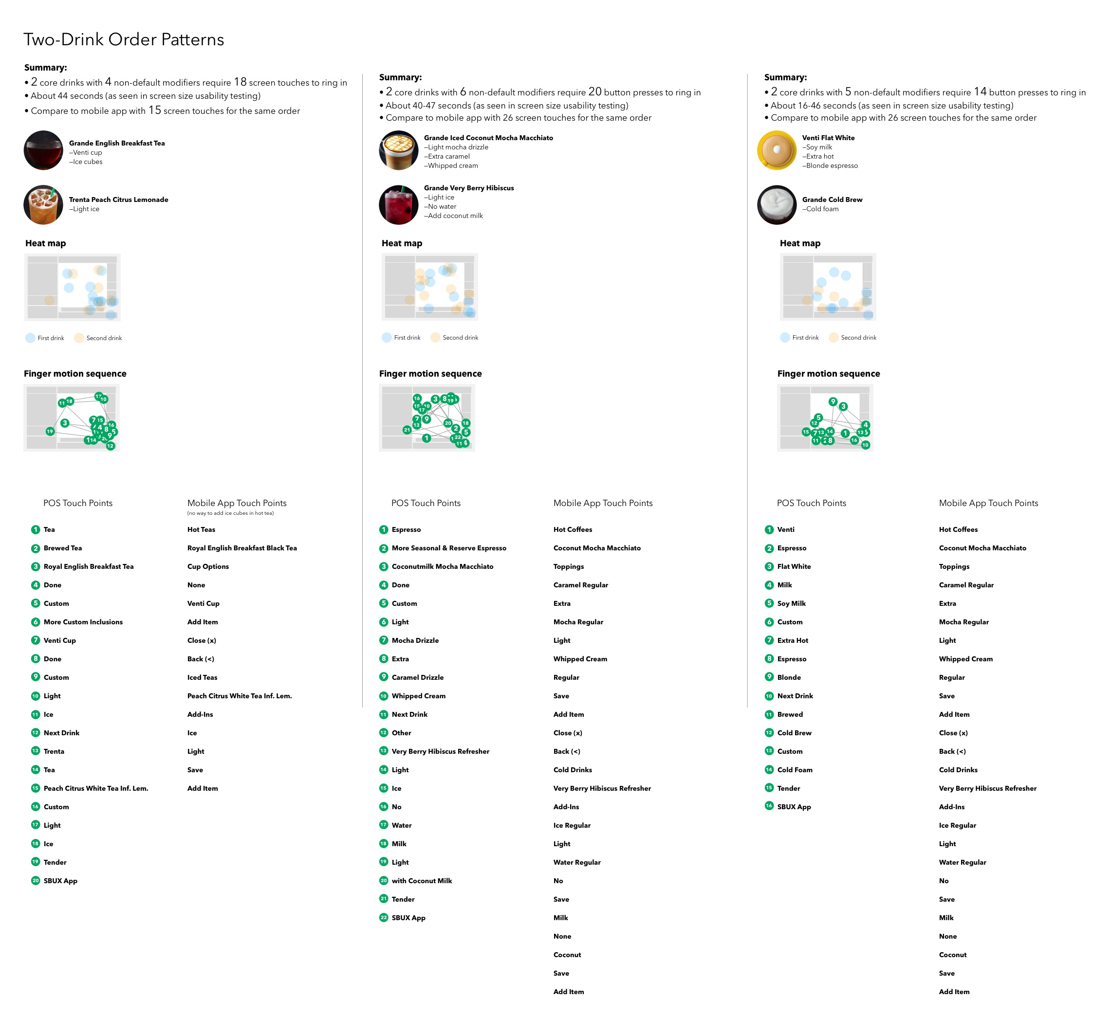
I created some hypothetical scenarios and through usability testing was able to determine how many screen touches were necessary and roughly how long the transaction might take. I also compared this to the steps necessary for ordering the same drink with the Starbucks mobile app.
Design
Now that I was more familiar with how baristas use the point of sale, I was ready to rapidly iterate on new concepts for redeeming stars. The existing method was a quick process that involved one “Redeem Stars” button. The system would determine which item on the check was the best value for redeeming 125 stars (the most expensive item). The new design would need to provide a way for baristas to specify which tier the customer wanted to redeem, anywhere from 25 to 400 stars. We usability tested our top concepts and came away with one winner, the “Sidebar.”
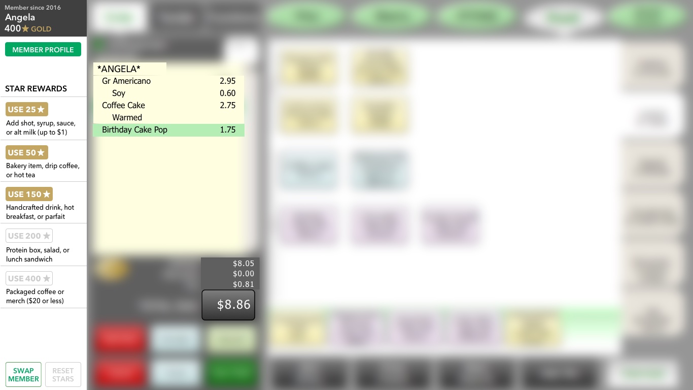
This project scope did not include a facelift for the antiquated point of sale UI, so I have blurred that portion out. The Sidebar was a new addition to the left of the screen, and made use of space at the time inhabited by a large on/off button. We tested this design with 18 baristas and store managers, and found that it performed well because it allowed them to keep their context within the customer’s order.

The sidebar would have many possible states. Here are just a few of them.
Touch paths
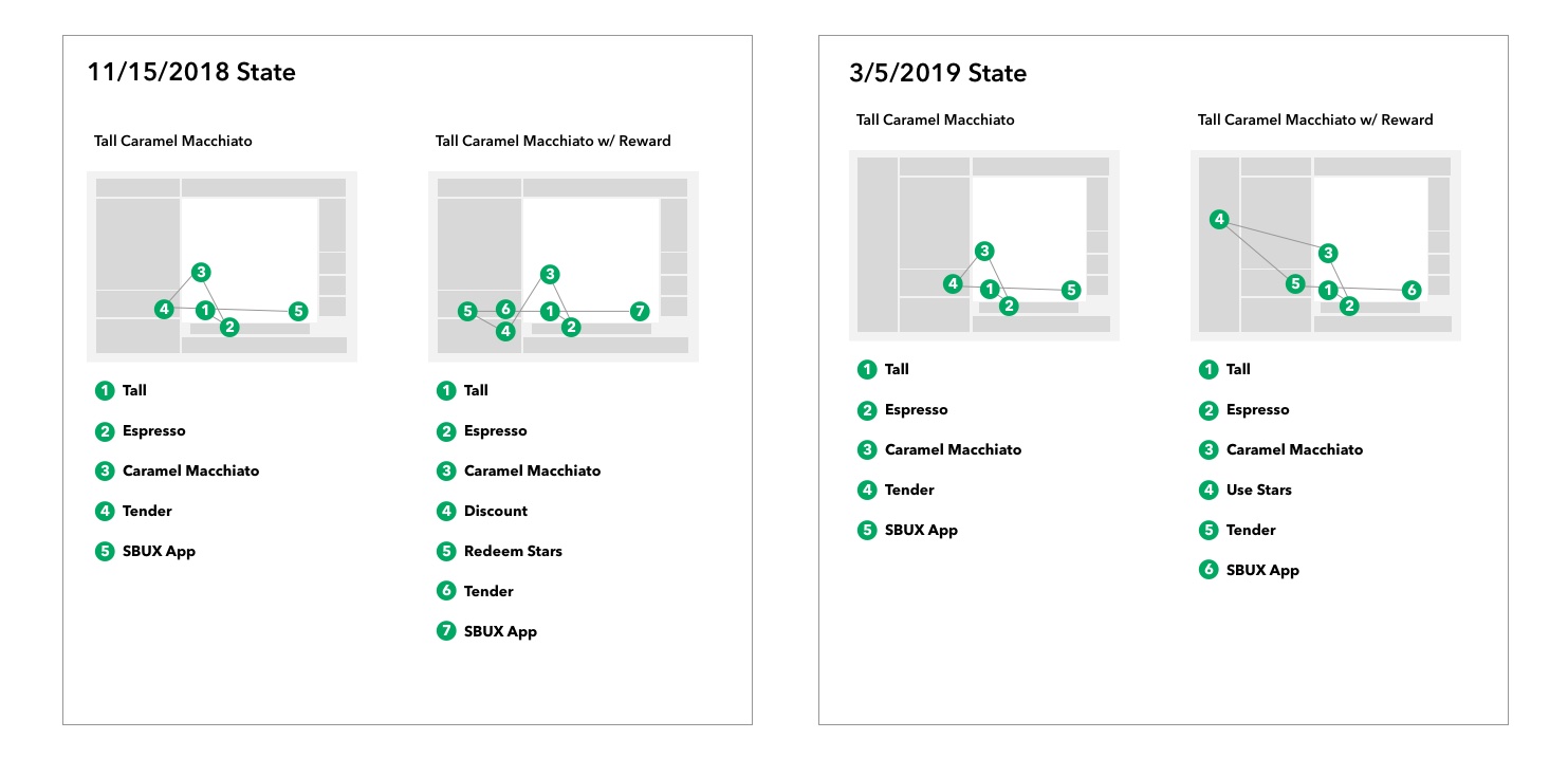
I created this diagram to show how touch paths would change based on the new features we were adding to the rewards redemption experience. Since baristas rely on muscle memory, we were concerned that transaction times might slow down. However, based on our usability studies with customers and baristas in the same room, the biggest risk to transaction time was customer understanding of the program itself.
Training
With over 200,000 baristas in North America needing to learn a new system quickly, we created a series of training materials. I designed and produced the clickthrough training that all store employees completed on iPads. We wanted to get baristas familiar with a new way of ringing up rewards transactions, but also to encourage them to have a new kind of conversation with customers about their rewards.
- The training was viewed 120K times in the first few weeks of launch.
- 92% of Store Managers and 81% of employees overall believed the iPad training was the most helpful tool in the launch of the updated Starbucks Rewards program.
“I feel like the iPad training is the best. Partners enjoy getting on the iPad.” – Store Manager
“I liked the training on the iPads. They are super helpful.” – Shift Supervisor
“…the simulated POS on the iPad. That was a great use of technology to aid in this training. Well done!” – Shift Supervisor