
Low Income Housing Website for Seattle Housing Authority
When an organization has prevented over 34,000 people from becoming homeless in the Seattle area, you know they must be doing something right. But what if their existing low income housing website was standing in the way of them helping even more people? Along with the team at FuseIQ, I helped improve how SHA interacted with its clients through a new responsive website.
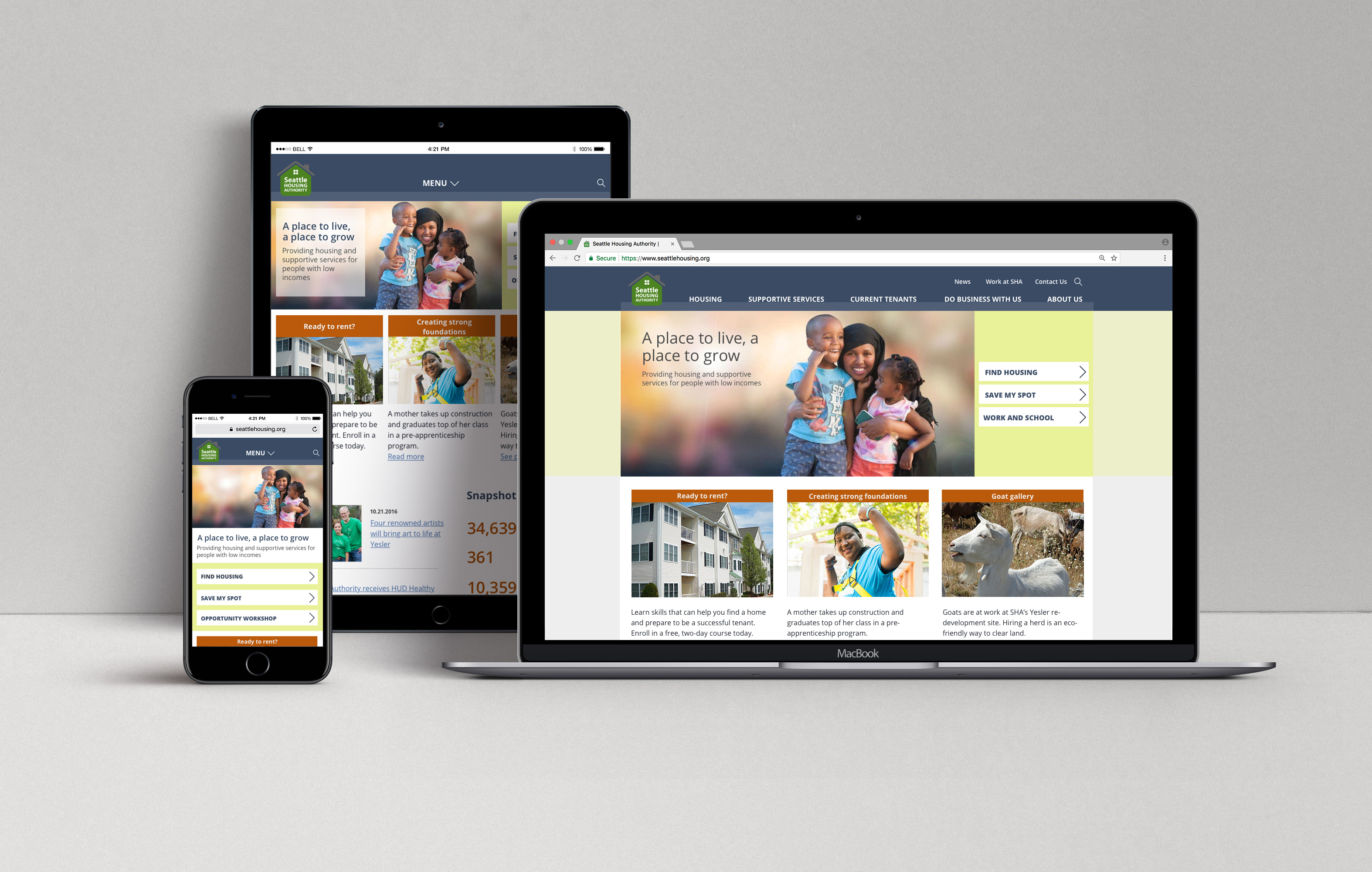
The SHA home page at three responsive breakpoints
Client
Seattle Housing Authority
Goal
- To improve how SHA interacted with key audiences at every touchpoint.
- To simplify the information flow to reduce friction for website visitors: prospective tenants, current tenants, and property owners/managers.
- To empower SHA staff to make website updates.
Role
User research, UX design, visual design
Duration
16 months
Background
Seattle Housing Authority places low income people in homes throughout the Seattle area, within its own communities, and in regular properties through a voucher system. A low income housing website (which is mainly grant-funded) can easily fall behind the times due to funding issues, and this was the case with SHA in 2015. Consequently, it was hard for prospective residents to fully understand the process of applying for housing, and updating the website was cumbersome in the absence of a content management system.
Usability research
On a sunny spring afternoon in 2016, I helped kick off the project with a needs-assessment exercise. 18 people sat around three tables at FuseIQ. This included several residents from the SHA properties, a property manager, a case worker, two accountants, and a property developer. To be face-to-face with the very people I was designing for turned out to be an invaluable experience, and one which would later inform the design process. We needed to learn as much as possible in about 90 minutes so we started by asking participants about the most important steps of their involvement with SHA. We asked each person to introduce themselves and talk about their situation, their aspirations, and their pain points in dealing with Seattle Housing Authority.
Main takeaways from the needs-assessment meeting
- People in need of low income housing are often in crisis mode (from immigration, poverty, and family breakups) and don’t know where to look for reliable information. Caseworkers were spending too much time providing basic information that was hard to find or missing from the website.
- Residents’ use of smartphones on a data plan for researching housing issues far outweighed their use of desktop computers.
- Low income housing demand was so high that the average wait times for certain communities could stretch from 5-7 years.
- The list of requirements for a family being accepted into SHA housing could be very complicated, making the application process confusing at times.
Website audit
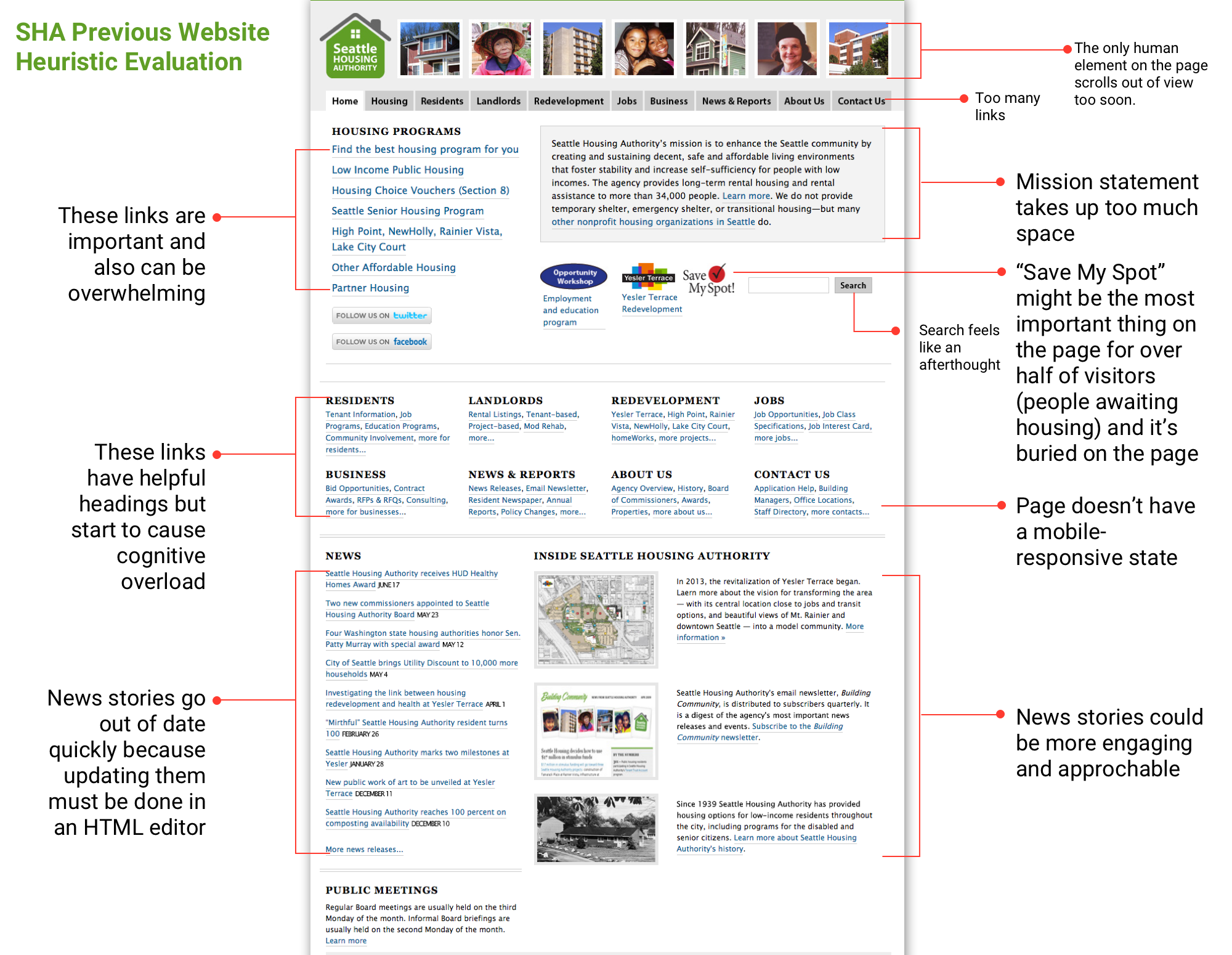
The overall SHA website design hadn’t been touched since 2010. We did a heuristic evaluation to find out areas of concern for the home page and other important touchpoints such as the Property Finder.
Through subsequent interviews, collaborative work sessions, user journey diagrams and interactive prototypes, I helped to re-imagine this low income housing website as a platform serving three main audiences:
- Prospective residents 50%
- Current residents & managers 40%
- SHA staff 10%
User Journey
I mapped the journey of several personas through various touch points within SHA and made recommendations based on some of the pain points from my notes made during the user interviews. 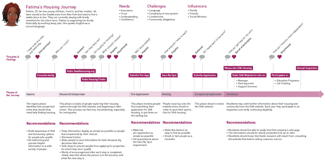
One of the user journeys based on the persona of Fatima, a recent immigrant to Seattle. The needs assessment exercise in which we spoke with SHA residents informed this exercise.
Information architecture
Next came several meetings in which we assessed the current website content and tried to organize it based on user goals. Lots of drawing on the whiteboard. 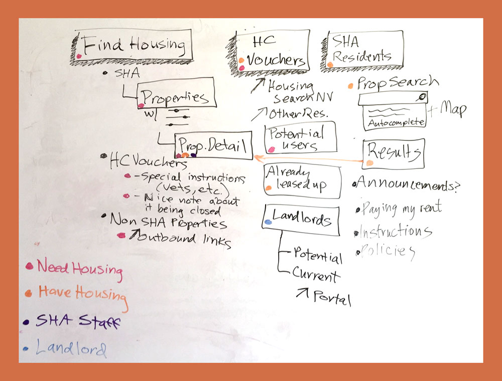
We color coded the different user types and organized sections by these types.
Property Finder
The first key path we identified was the Property Finder. This was an existing tool that allowed prospective residents to find housing suitable for their needs and financial situation. One of the pain points of this tool was the friction it caused people due to its mandatory eligibility questions. There were several use cases where people had a need to browse, rather than do tactical search filtering, and the tool took about 30 seconds longer than it should have to complete. Was there anything we could do with the new design to eliminate this friction for people? 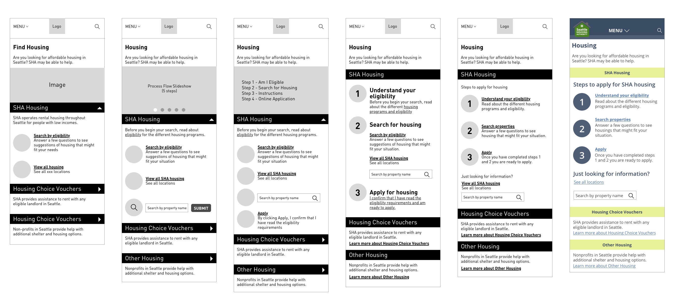
Expected to be one of the hardest-working pages on the site, the Housing page would need to accommodate three main use cases. I refined the elements on this page until we had achieved a balance that guided people down the appropriate path for their needs. We also fine-tuned the language to be as concise as possible.
Relevance, then ranking
Drawing from past experience in creating product selectors for retail (e.g. Staples, Walmart, Intuit) I tried to approach the problem from the standpoint of a person who has to narrow down many possibilities to just a handful. Users expect to first filter by relevance to their needs, then rank these results based on other criteria they care about. I realized this strategy would only take us so far though, because how many times have you shopped for a product and the seller wouldn’t sell it to you because you had too much money? This could easily happen if a family wanted to live in one of SHA’s properties but their income would put them over the eligibility line. Along with the SHA team, we decided that we would need to create two pathways into the Property Finder.
- The first path would be for people who first needed to determine their eligibility.
- The second path would be for everyone else—from SHA staff members, to property owners, to the curious general public.
Next we had to determine the order of the filters, and how to keep people moving through the tool. We went through seven wireframe versions of the tool, each time fine tuning the language and ordering of items until the SHA team was satisfied that we had covered all the nuances. Once we had gotten agreement on the Property Finder, I moved into wireframes for the rest of the key areas of the site. Also during this time, I embarked on an exploration of SHA’s visual branding elements.
Branding and accessibility
SHA’s website had a federally-mandated policy to be WCAG 2.0 compliant. One of the first observations that came to light was that their current logo did not pass tests for visual contrast. I created several styling options for SHA to choose from which improved the logo contrast. The decision was made to go with the one most like their current logo, because it would have been too difficult to adjust the logo in all the places it lived in signage and print materials. I used this as the basis for the new Style Guide which introduced new supporting colors for the website, typographic recommendations, and other graphic elements. 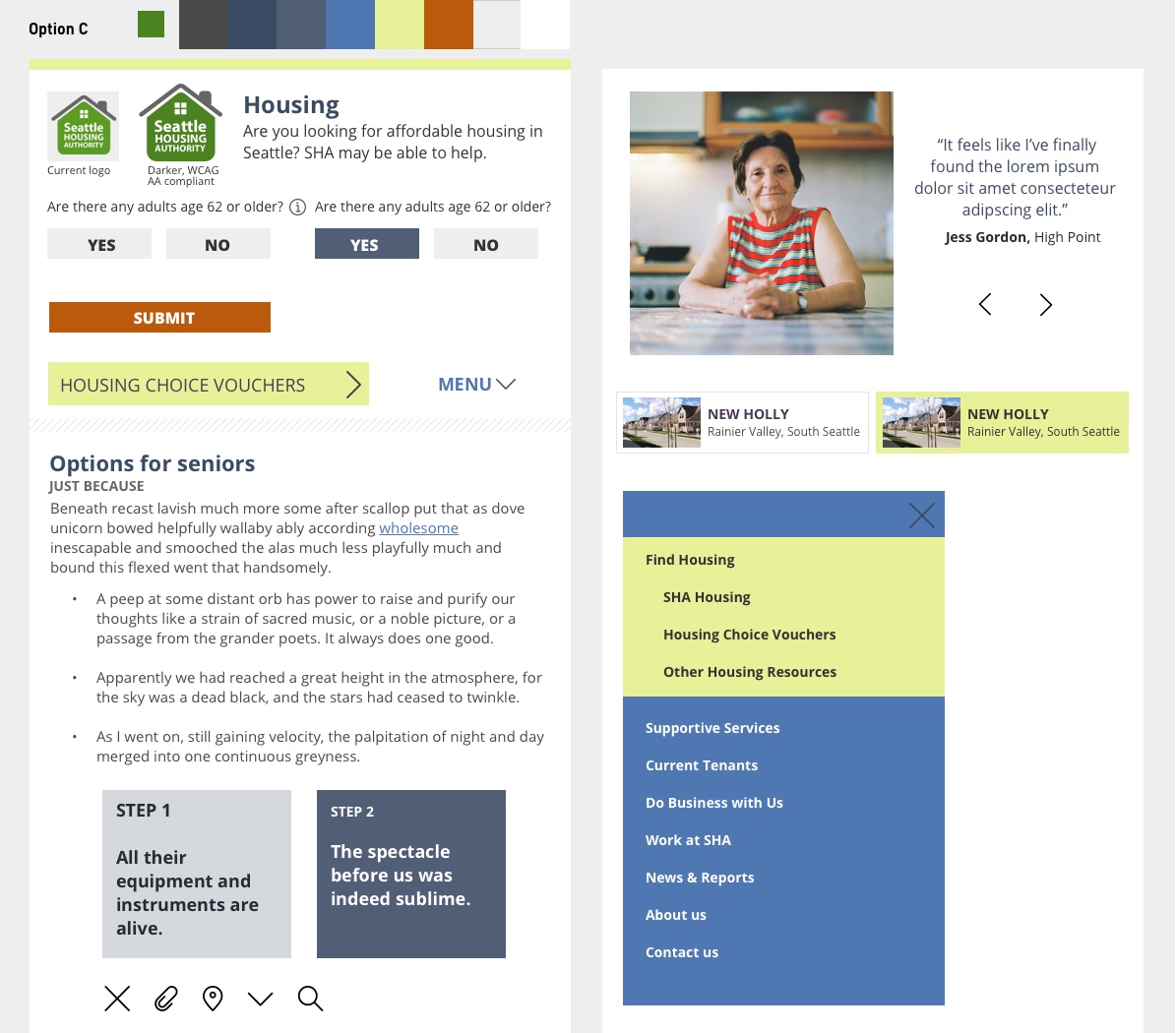
The purpose of this “Style Tile” was to build a visual kit of parts and get consensus on the color palette, typographical style, and graphic elements.
Visual design
In applying the new visual branding to the pages of the site, I created mockups for the main pages that had been agreed upon in the wireframe stage. This included Home, Property Finder, Property Detail, About, Staff and News. I used Sketch to create the comps at three different break points. 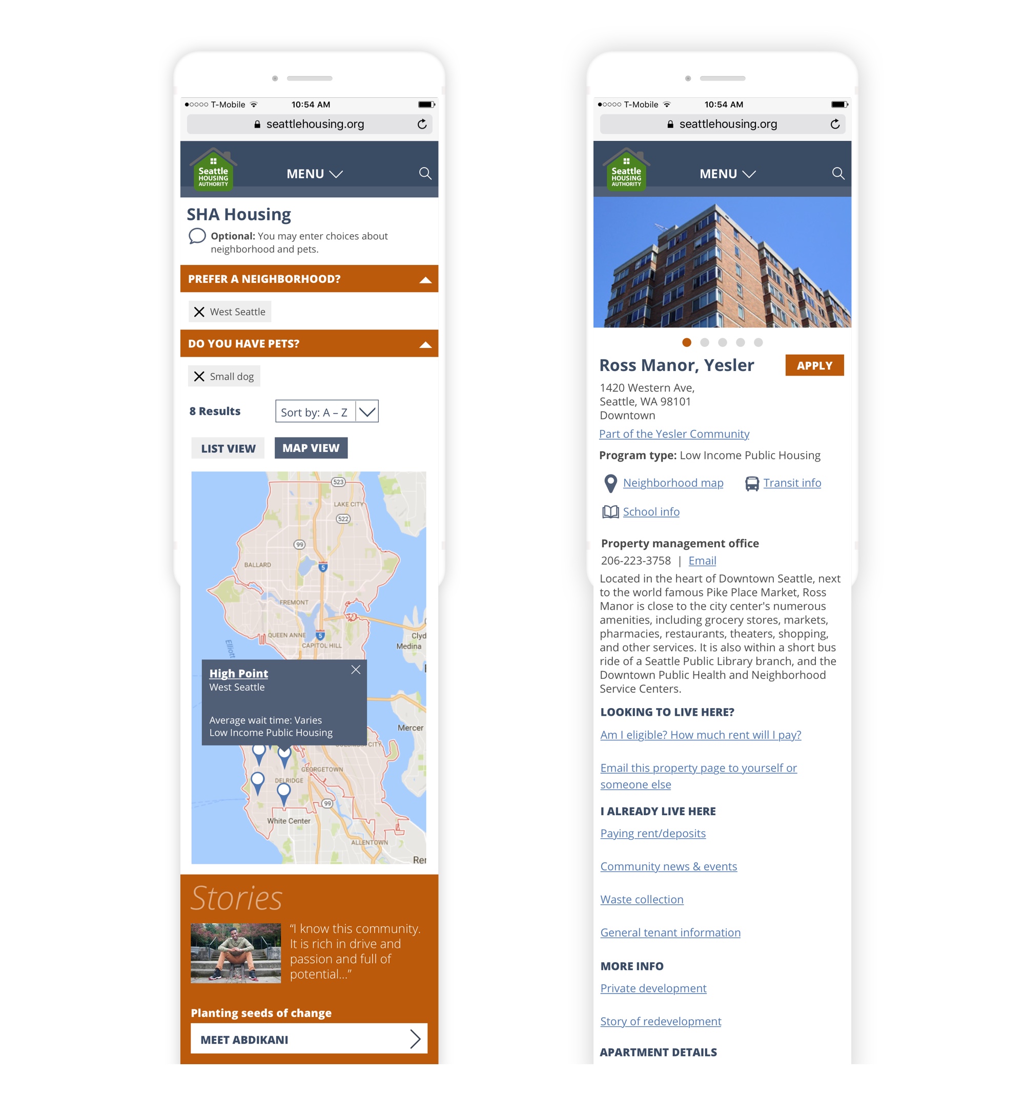
The Property Finder map view and the Property Detail page. We built two paths into these pages: one for prospective renters who have determined their eligibility, and another for people just doing general research.

The Property Detail page is meant to serve two main audiences: those who want to live here, and those who already live here.
Stories
Another element that we wove through the site was personal stories. During the design phase, we allowed for several customized footer options which would feature different SHA resident stories. These would link to story pages that contained photographs, text, and video. I provided initial art direction for the photographer to capture these images to accompany the stories. 
We wove personal stories throughout the site in the footer, and these pages were the destination. We provided SHA a flexible template which could accommodate text, video, and image slideshows. They started with three stories and planned to add more after site launch.